Every nonprofit has one . . .
The all-important donate page. Ideally it will be linked in a prominent, easy-to-find location on your organization’s homepage, a “donate” (or give or support) button will lead to a quick-loading, clearly designed page that makes it easy for donors to support your cause.
But it’s not always that simple.
What’s the problem, you ask? We often get in our own way by giving users excuses to leave the page.
In fact, there’s a session all about this at NextAfter’s NIO Summit this September. That’ll be worth checking out, but while you’re here, we’ve got a few tips for you on how to hone the perfect donation page:
- Remove exit opportunities. What does that mean? Any button or link that distracts from the donation is an “exit opportunity.” The most important ones to omit are headers and navigation bars. Anything that’s front and center that has a clickable link or button makes it all too easy for potential donors to bounce.
If the back end of your website is tricky to work with, consider using tools like Unbounce or Mailchimp to make custom landing pages with simple, effective layouts.
Should I really remove every link, you may be wondering.
Yes, we even mean links explaining other ways to give, or the good that your organization can do with the money you receive!
Think of it this way: if someone has navigated to your donation page, they’re showing a certain level of intent. You don’t have to link away from the donation page to make the case for giving. They are already somewhat convinced, and you should have the copy on the page itself to do that.
- Cut down the friction. While donors who give through the mail often read a 4- to 8-page letter before they give, donors who give online can easily get fatigued seeing an essay-length page of words to read before seeing the actual donation tool.
Remember, many potential donors will be looking at this page on their phones (though you should determine the majority of your use through a tool like Google analytics). A large amount of text means lots of scrolling. Ideally, visitors to your website will be able to see the top of the donation form at first glance without having to scroll far.
While there’s no “perfect” word count, we’d suggest a few sentences explaining your organization’s mission, a couple of bullet points about the impact a gift can make, followed by a simple call to action. No need to mince words: “Donate now” is clear and effective.
This is important: you do still need to make your case! Don’t omit copy altogether. Donors are giving to your cause, and this online gift isn’t a heartless transaction. They deserve one final reminder about what their gift will achieve.
- Add an open gift field. While a list of pre-set donation options can help make giving easy, you can also let donors enter any amount to give. Why keep a donor from giving an amount of their choice? I recommend an array that starts low, around $25, and has two or three higher options, and then an open box for an “other” amount.
Bonus tip: include a check box to make the gift recurring each month. Your initial gift might be lower, but you’ll have a new recurring supporter.
- Make your forms less daunting. It can be defeating to get to the end of a transaction online, only to find that you have 10+ fields of required information to fill out before you’re done.
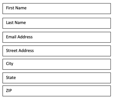
While we recommend that you keep key fields for First Name, Last Name, Email, and Mailing Address, consider grouping several fields on one line. For example, instead of this:
Try this:
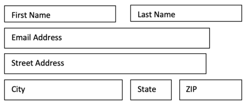
Although the number of fields is the same, the form went down from 7 lines to 4. It’s a quick change to make, but it can go a long way for people who don’t like filling out forms (i.e., most people).
NextAfter’s crew at the NIO Summit has worked with many organizations to perfect their donation pages (and they’ve got a whole library of tests to show for it). Be sure to check out the summit for more digital nonprofit expertise and to learn how to optimize your nonprofit’s website for donations.
Any other tips on improving donation pages? Let us know in the comments or shoot me a note with your questions!